
I have a little blog hop for you today! A few of us were doing a zoom craft session with Loll leading us in a few techniques for using our Perfect Pearls (mine were sitting much neglected in my craft cupboard).
First up we tried watercolouring die cuts with them.
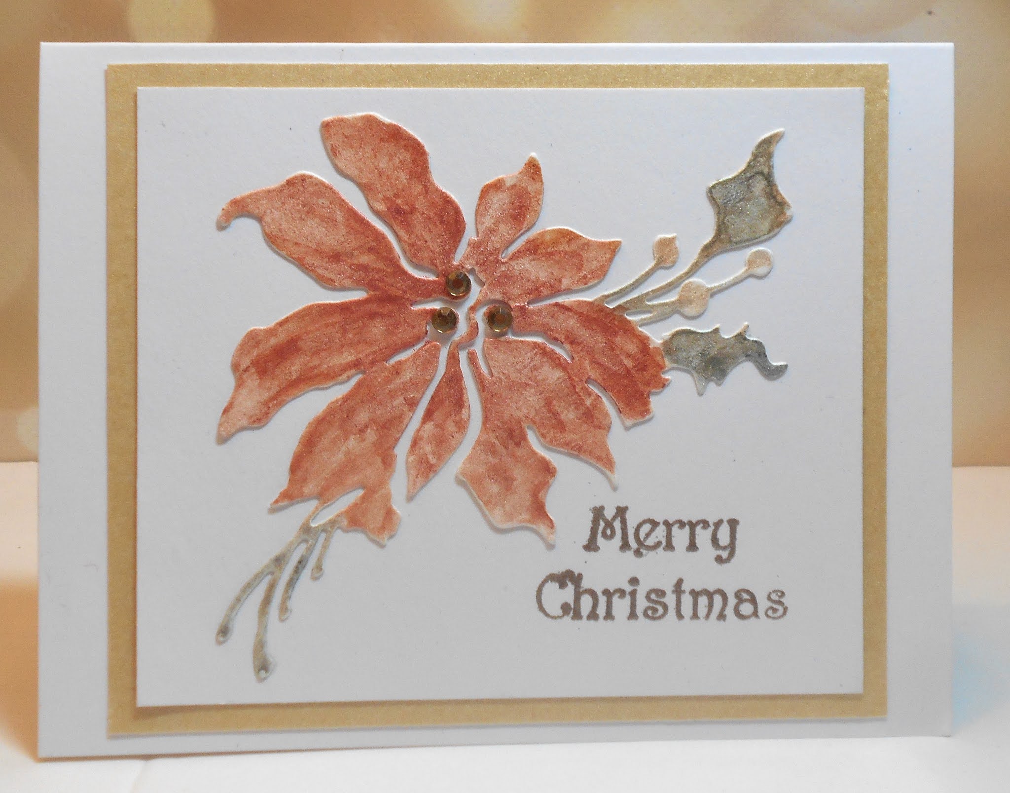

For this one, I tapped a green ink pad on my craft mat, sprinkled a bit of green Perfect Pearls onto it, then spritzed with a little water and blended them before painting the die cut.
Then we tried smooshing with them to create backgrounds. I made some backgrounds on white mixed media and white watercolour but they were very similar to smooshing with inks or Magicals. What I did find really intriguing was using the "interference" Perfect Pearls colours on black watercolour paper. I got several really beautiful backgrounds from them.

This is blue interference Perfect Pearls - sprinkled on my craft mat, spritzed with water, and then I smooshed into it with black watercolour paper. Hopefully you can see some of the shimmer in the photo. I added the die cut reindeer, stamped the sentiment in a similar blue, and had the perfect shade of blue shimmer cardstock for the base.
Hop on over to the rest of the Zoom group to see their results:
Bonnie https://bon2stamp.blogspot.com/2020/09/perfect-pearls-with-friends.html
Brenda https://inkspiredtostamp.blogspot.com/2020/09/playing-with-perfect-pearls.html
Christine https://itsacarddaysnight.blogspot.com/2020/09/a-perfect-pearl-revival.html
Darnell https://www.djkardkreations.com/2020/09/playing-with-pp.html
Loll https://www.stampingwithloll.com/2020/09/zooming-with-friends-september.html

Supplies for card 1:
Stamps - Great Impressions sentiment
Ink - Versamark
Paper - white, mixed media, gold shimmer cs
Size - A2
Accessories - Penny Black poinsettia die, various colours of Perfect Pearls, champagne embossing powder, gold gemstones
Supplies for card 2:
Stamps - A Muse sentiment
Ink - Distress Pine Needles, ColorBox Cranberry
Paper - white cs, mixed media
Size - A2
Accessories - Penny Black holly die, green Perfect Pearls, clear embossing powder, Lil Inker stitched rectangle die, red pearls, fun foam
Supplies for card 3:
Stamps - Rubber Soul sentiment
Ink - Distress Blueprint Sketch
Paper - black watercolour paper, blue shimmer and white cs
Size - 4.25" square
Accessories - Memory Box reindeer die, blue interference Perfect Pearls, fun foam
Wowzers! All your cards with perfect pearls are gorgeous Susan! I love the poinsettia ... very vintage looking with the colours. Your holly leaves are so pretty with the mix of ink and pp. But it's the night sky that is so AMAZING! I love this and have to give it a try. I don't have any of the interference PP, but I do have interference Pearl Ex. Just need to find a way to seal it. Lots of fun on the zoom call! xx
ReplyDeleteawesome cards Susan, love the soft colours of your poinsettia and your night scene is amazing. It was so much fun playing with PP during the zoom session :)
ReplyDeleteVery pretty cards!
ReplyDeleteAll so lovely, but wow! the third one with the interference PP on black watercolor paper is GORGEOUS and my favourite.
ReplyDeleteGlad to see you’re doing good and back crafting.
Your Threefer showcasing PP are all sensational, Susan! While I love both of your die-cuts, I agree with you about the difference between straight PP and PP that has been added to a similar colored ink. I love that really elongated holly spray and perfect sediment! And now I'm intrigued by the Interference Paint on black and love the design you created. I have an round tray of Pearl-Ex and some of the cakes are called Interference. I never knew what the heck to do with them, so thanks to your inspiration, I'm going to have a play with them and see what happens! Hugs, Darnell
ReplyDeleteAll three of these are absolutely BEAUTIFUL Susan!! I thought your 1st card was my favorite, but then I saw your 2nd and thought that was the best! And then of course your 3rd and nighttime sky card came up and I was totally blown away...absolutely GORGEOUS!! Lovely, lovely cards Susan! Hope you're feeling better and stronger every day!! Hugs. :0)
ReplyDeleteI definitely need to smoosh some black into the interference pearls! Love the way your background turned out! The poinsettia is really pretty and doesn't look streaky to me. I found that some of mine were very streaky! Your holly turned out so bright and pretty! Mixing with ink does give richer colors! Can't wait till we get together again!
ReplyDeleteFabulous results Susan, and the perfect pearls are definitely something that get tucked away and forgotten about, but your results here are fantastic and the shimmer and shine is so gorgeous on all of them. x
ReplyDeleteGorgeous results, and I do love the PP on the black card -- gorgeous!
ReplyDeleteWhat a gorgeous job you did on these! I’m super fond of your midnight background. The look of shimmer on black paper is like no other! You inspired me to try that again. All three cards are just beautiful!
ReplyDeleteYour Christmas cards are beautiful. The poinsettia came out soft and adding the pearls to the ink just sparkles on the leaves. Your sky is awesome. It is beautiful on the black card stock. This was so much fun.
ReplyDeleteSuch beautiful cards - WOW!
ReplyDeleteSandy xx
All three cards are beautiful, but that last one is really outstanding! I LOVE the blue perfect pearls on the black! It made for a gorgeous card!
ReplyDeleteOh gosh, I want to try all of these right now...your interference card is amazing, but I love your die cut pieces too! Wowzer!
ReplyDeleteOh, what lovely cards Susan! I like the softly colored poinsettia as well as your darker holly branch - and that sky is to die for! I have to see if I have any interference PP's!
ReplyDeleteI so enjoyed reading your post Susan and learnt lots....Thank you x. The interference powder on the black looks amazing and what a pretty effect on card number two x.
ReplyDeleteAll three cards are gorgeous, Susan! The blue interference Perfect Pearls on black watercolor paper looks especially amazing! Thank you for sharing your findings. I'd love to use my PP sometime soon too.
ReplyDeleteHideko xx
gorgeous results...I should find mine and actually use them.
ReplyDeletexx Karen
I popped back to take a closer look....Off to find the 'goodies' to try this technique out on card number three. It looks stunning Susan. Thank you for the inspiration x.
ReplyDelete