A blog devoted to the cards I make in my tiny upstairs space. When my sister stays there, she calls it an "artist's garret". I'm not an artist, but am an enthusiastic cardmaker - hence the title "Cardmaker's Garret".
___________________________________________________________________________________________
Showing posts with label Distress stains. Show all posts

Saturday, 15 January 2022

Blue and White Christmas

It's time for January's second Peace on Earth Christmas challenge.  I went with one of my favourite Christmas colour combinations - blue and white.


I created the background by swiping various blue Distress stains across some watercolour paper that I'd lightly spritzed with water to help the colours blend.  When dry, I stencilled some tiny snowflakes with white embossing paste.

I layered the Delicate Pine Frame die over it and added it to a panel stamped with a right angle sentiment.  Then popped that panel up on fun foam on the card base.

I was inspired by the white tree and blue and white colour scheme of the lower left image on Peace on Earth's mood board (although the challenge is an "anything goes" Christmas challenge so you don't have to use the mood board).

Head on over to the Peace on Earth challenge blog for more inspiration!

I used up a little off-cut from the background and created this mini slimline:

I ran a piece of white cs through a dotted embossing folder.  Because the mini slimline size is 6.25", the embossing folder left an unembossed strip at the bottom - perfect for stamping the sentiment.

I layered a deer / tree die over the background piece and assembled the card.

I really like the mini slimline format - a great way to use up little scraps!  

I'm also entering the following:

Colorful Options "Winter Blue" challenge
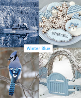
 

The Sisterhood of Crafters "The Color Blue" challenge 

The Four Seasons "Anything Goes Winter" challenge


Supplies for card 1:
Stamps - unknown corner sentiment
Ink - Distress Faded Jeans
Paper - white and mixed media cs
Size - A2
Accessories - various blue Distress stains, Memory Box tiny snowflake stencil, white embossing paste, Memory Box Delicate Pine Frame die, fun foam

Supplies for card 2:
Stamps - Rubber Soul sentiment
Ink - Distress Faded Jeans
Paper - white and mixed media cs
Size - 6.25x3.25"
Accessories - unknown deer / tree die, various blue Distress stains, Cuttlebug embossing folder, Memory Box tiny snowflake stencil, white embossing paste

Tuesday, 16 March 2021

Art Deco Flowers

Do you ever finish a card and wish you'd done something differently?    This is one of those that I like for some things but wish I'd done something else with the background.

I wanted to use my long neglected Distress stains so followed this tutorial on watercolouring with them.  It's harder than it looks. 

I used three shades of blues and mauves for the flowers and two shades of green for the stems and leaves. Once I was done pulling the colours out, I felt I'd lost too much definition in the flowers so I went over the outline again with the stains and restamped - that is the joy of working in the MISTI!

The sentiments are part of the stamp and I did them at the end by going over them with the dew drop size Memento Tuxedo Black.

I trimmed my panel and sponged the edges, blending together Bundled Sage and Iced Spruce.  A bit of black splatter finished it off. I mounted the panel on fun foam for dimension.  In hindsight, I wish I'd done lighter sponging and used the shades of green I used for the stems.  Or left the sponging off altogether and just done a bit of splattering.


I'm linking it up with:

We Love Chocolate Baroque - "I Love..." - what do you love when you are creating.  I love trying new techniques, I love using Distress products, I love the Art Deco style of these Chocolate Baroque flowers, I love flowers as a theme for my cards.

The Paper Players - "A Colour Challenge"


Thank you for stopping by!


Supplies:
Stamps - Chocolate Baroque Wish Flower
Ink - Memento Tuxedo Black, Distress Iced Spruce and Bundled Sage
Paper - watercolour paper, cream cs
Size - 4.75x6.5"
Accessories - Distress Stains - Bundled Sage, Peeled Paint, Seedless Preserves, Faded Jeans, Milled Lavender

Sunday, 9 December 2018

Christmas Challenges

I've been busy since my last post - getting Christmas baking done in advance, making more Christmas cards to write and mail, doing some extra volunteer shifts at the therapeutic riding as our university student volunteers are all busy with exams.

But got inspired by a couple of challenges to get a post done.

First up, the Double D "Run Rudolph Run" Challenge wants to see a deer on our projects:


I took a piece of mixed media cs and spritzed it with water and then rubbed three different Distress stains over it, and spritzed a bit more to get the colours to blend.

I trimmed it with a deckle edge die and added a gold embossed sentiment. I die cut the reindeer out of a gold moire textured cs and again out of white cs - glued them together for more substance. Also die cut a few little gold stars. Glued the pieces on the background and popped up on fun foam.


And for the 4 Craft Chicks "Ribbon and Bows" challenge:


I stamped and heat embossed the image and sentiment in green on a cream cs, trimmed it and cut a slightly longer panel of green cs, mounted the image, and then wrapped the bottom of the green cs with a gingham ribbon and added a bow.

Since the image is from a song, I mounted it on a music-embossed background and used fun foam to popped it up on the card base.

More Christmas cards to come in the next few days!


Supplies:
Card 1:
Stamps - Rubber Soul sentiment
Ink - ColorBox gold
Paper - white, moire textured gold, mixed media
Size - A2
Accessories - Penny Black Leap of Joy die, star die, Spellbinders deckle edge rectangle die, Distress Stains (Chipped Sapphire, Shaded Lilac, Dusty Concord), detail gold embossing powder, fun foam


Card 2:
Stamps - Old Island Partridge in a Pear Tree, Rubber Soul sentiment
Ink - ColorBox Evergreen
Paper - PTI Vintage Cream cs, scrap of green cs
Size - A2
Accessories - gingham ribbon, Ranger Evergreen embossing powder, musical score embossing folder, fun foam


Tuesday, 24 July 2018

Splats for a Non-Traditional Christmas Card


I think of traditional Christmas cards having themes like Santa, reindeer, snow, stars, trees, doves, etc.  And they are the kinds of themes I like to use. So when I saw the latest 52 Christmas Card Throwdown challenge "Non-Traditional Christmas Card", I was going to skip it, but then I decided on this card:


I kept the colours traditional, but went with the rather strange theme of splats!

You take Distress Stains and prime them by pressing down on your craft mat or scrap paper to get the stain flowing. Then on mixed media cs (you get richer colour than on regular cs), you press down really hard and simply splat the Distress Stain on your mixed media cs with the sponge dauber.

I used red and quite an olive green shade of green. Then between them, I stamped my sentiment with Versamark and heat embossed with gold.

I die cut it with an oval die and popped it up on fun foam on a gold card base. a

Hope this counts as non-traditional!


Supplies:
Stamps - PTI sentiment
Ink - Versamark
Paper - gold cs, mixed media cs
Size - A2
Accessories - Distress Stains (Peeled Paint, Festive Berries), Spellbinders oval die, gold embossing powder, fun foam


Thursday, 7 September 2017

Winter Sky

When I was growing up in Ontario, I always loved the pale winter skies with the silhouette of bare tree branches against it.  I tried to capture that in this card:


I heat embossed the image in sparkly embossing powder on watercolour paper.

I did a watercolour wash background using Distress Stains and lots of water - the stains give a lovely pale look, typical of a winter sky on a cold day.  I put a bit of each on an acrylic block, spritzed with water, and brushed on with even more water.  Love the way the colours blended into each other perfectly!

When I stamped the sentiment directly on the panel, it ended up crooked so I restamped it on a scrap of watercolour paper, cut it into a thin banner, and taped it over the crooked one.

I popped it up on fun foam on a pale blue card base that tones in nicely with the middle band of colour.  The final touch was adding some glitter along the snow lines.


It's going off to the following challenges:

CAS Watercolour "Silhouette".

CAS Mix Up "Watercolour Wash" - I have stamping, the watercolour wash, and heat embossing / emboss resist as my "other".

SCS Ways to Use It "Oldie but Goodie" - I used one of my oldest stamp sets for it.

SCS Christmas Card Challenge for September "Trees or Outdoor Scenes".


Supplies:
Stamps - SU Lovely as a Tree, Penny Black sentiment
Ink - Versafine Smokey Grey
Paper - watercolour paper, pale grey blue cs
Size - A2
Accessories - SU Irridescent Ice embossing powder, glitter, fun foam


Saturday, 13 May 2017

Poppies Two Ways

One of the techniques that Loll (Stamping with Loll), Christine (It's a Card Day's Night), Nancy (scandinancy creates), and I did at our craft retreat was stamping / watercolouring with Distress Stains, a technique I learned from Heather Telford (see her video here). 

I used a Penny Black poppy stamp and inked it with two pink stains and a green.  I couldn't decide whether or not I wanted to add some splatters to it, so repeated the stamping and created two cards - one with splatter and one without.


For this one, I watered down a bit of the green Distress Stain and splattered with a paintbrush, then random-stamped a bit of text, and sponged a bit of Distress ink around the edge.  I added vertical sentiment and popped the panel up on fun foam.

I'm linking it up over at CAS Mix Up where the May challenge is splattering.  I have stamping and splattering, and for my "your choice" elements, I have watercolouring and sponging.


For the second version, I was inspired by this image on an Etsy site that is this week's choice for today's SCS Inspiration Challenge:

I used pink and green, ran the sentiment across the stems of the plant like the words in the inspiration photo, and added some trios of pearls like the trios of dots in the photo.


I'm also linking it up to CAS Watercolour as the May theme is flowers.

I really like Heather's technique for watercolouring with Distress Stains and will use it more often - a great way to get more use from the Stains.


Supplies:
Stamps - Penny Black poppies; on the first card - Gina K sentiment and Penny Black text; on the second card - Memory Box sentiment
Ink - on the first card - Distress Peeled Paint and Old Paper;  on the second card - Versafine Smokey Grey
Paper - watercolour paper, PTI Vintage Cream cs
Size - A2
Accessories - Distress Stains - Spun Sugar, Worn Lipstick, Peeled Paint;  fun foam;  on the second card - pink pearls


Wednesday, 10 May 2017

Splatting and Chatting

I am having a wonderful week with Loll Thompson, Christine Alexander, and Nancy Littrell.  We're all staying at Christine's house and working our way through a bunch of techniques, making backgrounds and pieces for future cards, putting a few cards together, chatting a lot, eating very good food, and drinking some very good wine!  Just a note to self for future reference, wine dulls my creativity so trying to come up with ideas in the evening is just hopeless!

Here are two cards I made using the Distress Stain splat technique that Loll demonstrates on her video here.

It's a wonderful simple technique - simply splat on your cs with the sponge dauber on the Distress Stains (making sure they are primed and the colour is flowing first).

The cards are quite different to my usual style, especially the first one that has a kind of retro look, but I know just the person to give that one to!

Both sentiments are die cut using black for nice contrast, and the focal panels on each card are popped up on fun foam.

Watch for more of the results of our get-together in upcoming posts!


Supplies:
Ink - Distress Stains - Fired Brick, Barn Door, Pine Needles, Tarnished Brass, Brushed Pewter
Paper - mixed media, black and white cs
Size - 4.75" square for red and green one, A2 for gold and silver one
Accessories - Dee's Distinctively Merry Christmas, Simon Says Stamp Holiday Frame, fun foam


Sunday, 2 April 2017

Pink and Green Tulips

The CAS Watercolour challenge for April is a colour challenge:


Very appropriate colours for this time of year, I think, as I immediately thought of lovely bunches of pink tulips.  So that inspired my card.


It is so much fun being on the Design Team for CAS Watercolour.  It's really making me explore all the different ways of doing watercolouring.  For this card, I turned to Heather Telford's tutorial here of colouring the image with Distress stains and then pulling the colour inside the lines with a brush and water.

Doing it in the MISTI makes it so much easier.  I inked up my outline stamp of tulips with three shades of pink and and two of green Distress stains, and then stamped onto hot press watercolour paper.  I took my paint brush and water and pulled the stains into the image to fill them in, add shading, etc.  I lost a bit too much of the outline so, when dry, I reinked the stamp with the same stains (luckily I'd left it in the MISTI - if I hadn't, I wouldn't have been able to do this step) and restamped.

I watered down a bit of one of the green stains and did a tiny bit of splattering.  I trimmed the image down with a stitched rectangle die.  Then I stamped and heat embossed the sentiment on vellum and cut it out with a banner die.  The panel is popped up on fun foam.

Since this was a new technique to me, I wasn't totally happy with my first attempt.  It wasn't bad enough to toss so I turned it into a card too.  Here it is:


I used a bit too much water on it which makes the flowers look a bit too faded out, and I restamped the image while the flowers were still wet so even my restamping bled out a bit.  I also added more splatter and a different sentiment treatment.  I like this version, but prefer the one above.  How about you?

You have until April 24th to join in at CAS Watercolour.  Please be sure to follow the parameters of the challenge - your card must include watercolour of some sort, have a colour scheme of pink and green, and be CAS (clean and simple).

For more inspiration, check out the other cards by the Design Team and our Guest Designer, Marcia of Marcia K Designs.


Supplies:
Stamps - Technique Tuesday Tulips, Stampendous sentiment
Ink - Versafine Olympic Green (sentiment on first card), Distress Peeled Paint (sentiment on second card)
Paper - white cs, hot press watercolour paper, vellum
Size - A2
Accessories - Distress Stains (Peeled Paint, Forest Moss, Spun Sugar, Tattered Rose, Worn Lipstick), Lil Inker stitched rectangle die, banner die, clear embossing powder, fun foam


Thursday, 24 September 2015

My one and only ever steampunk card

Steampunk is so not my style!  But I decided I would make a steampunk card to thank my best friend for taking me to see a version of Shakespeare's Comedy of Errors that had sets and costumes done in steampunk style.  It was a great production and we enjoyed it so much.  Here's some photos of their set:

The Comedy of Errors


And here's the card I was inspired to make:


I wanted to capture the large clock and gears from the set.  Because I'm not a steampunk person, I had to borrow the gears die from a friend.

I'm entering it in the Mixed Media Card Challenge "Friendship".  I used Distress stains with the clock stencil, ink and embossing powder for the sentiment, and textured cs for the gears die cut.

And it's going into the Less is More challenge "Technology".

That's it for steampunk for me!

Supplies:
Stamps: Printworks sentiment
Paper: white and dark brown cs
Paper Size: A2
Ink: unknown dark brown pigment ink spot
Accessories: various Distress stains, TCS clocks stencil, Memory Box gears die, clear embossing powder

Thursday, 9 July 2015

Happy Birthday, Loll!

Finally - I have a new computer, it's all set up thanks to a techie friend, and I'm excited to be back using my new blog.

Since Loll was the person who inspired me to enter blogland and helped me set up my blog, it seems appropriate that I start off on my new computer with the birthday card I made for her.

The background was done by embossing my cs with a flowery embossing folder, then dabbing Distress stains on my craft sheet and painting the raised areas of the embossed panel - the Distress stains give a lighter, more translucent look than inks.  I let it be the star of the card and just added a simple die cut navy blue sentiment (layered a couple of times for more substance) and a matching navy border.